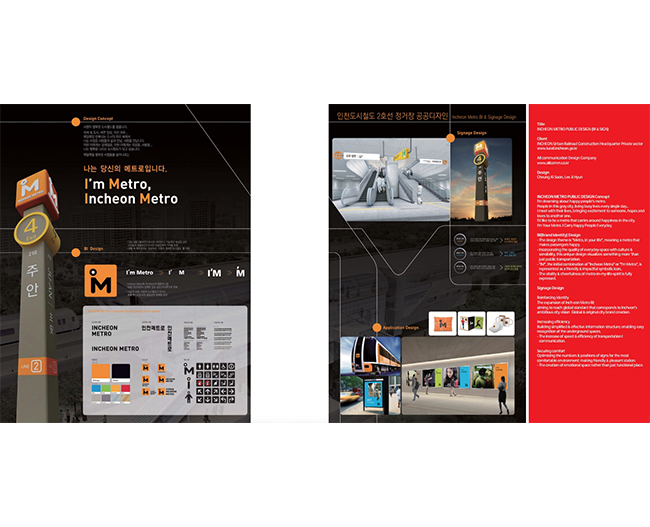
 Title
TitleINCHEON METRO PUBLIC DESIGN (BI & SIGN)
ClientINCHEON Urban Railroad Construction Headquarter Private sector
www.iurail.incheon.go.kr
All communication Design Company www.allcomm.co.kr
DesignCheung Ki Soon, Lee Ji Hyun
INCHEON METRO PUBLIC DESIGN Concept
I'm dreaming about happy people's metro.
People in this gray city, living busy lives every single day...
I meet with their lives, bringing excitement to someone, hopes and
loves to another one.
I'd like to be a metro that carries around happiness in the city.
I'm Your Metro. I Carry Happy People Everyday.
BI(Brand Identity) Design- The design theme is "Metro, in your life", meaning a metro that
makes passengers happy.
- Incorporating the quality of everyday-space with culture &
sensibility, this unique design visualizes something more 'than
just public transportation.
- "IM", the initial combination of "Incheon Metro" or "I'm Metro", is
represented as a friendly & impactful symbolic icon,
- The vitality & cheerfulness of metro-in-my-life-spirit is fully
expressed.
Signage Design Reinforcing identity
The expansion of Inch eon Metro BI;
aiming to reach global standard that corresponds to lncheon's
ambitious city vision Global & original city brand creation.
Increasing efficiency
Building simplified & effective information structure; enabling easy
recognition of the underground spaces.
- The increase of speed & efficiency of transportation I
communication.
Securing comfortOptimizing the numbers & positions of signs for the most
comfortable environment; making friendly & pleasant station.
- The creation of emotional space rather than just functional place.