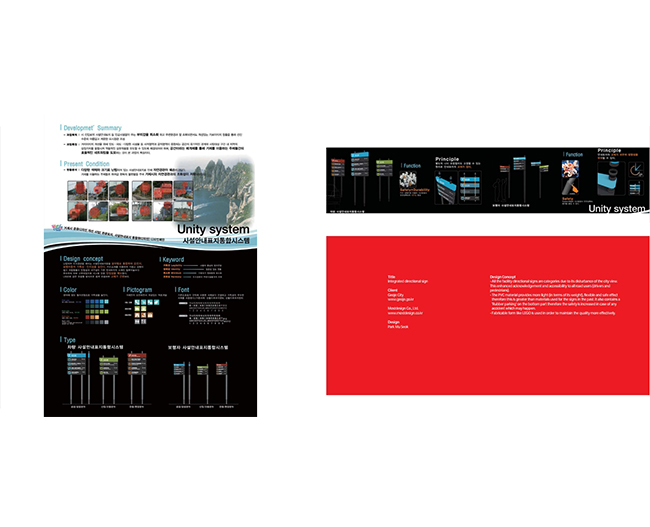
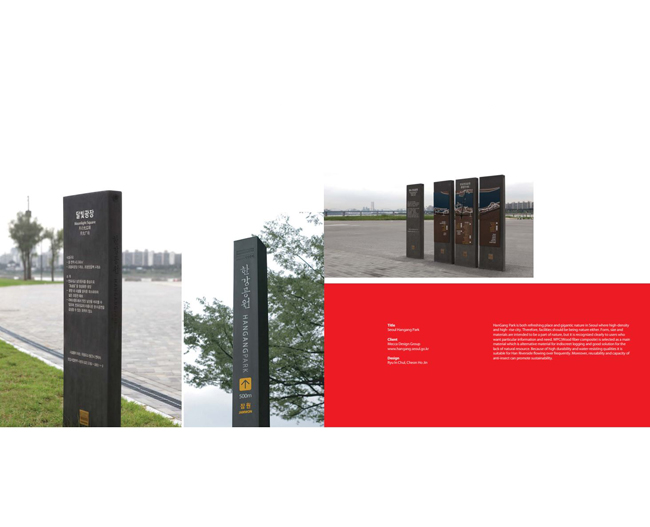
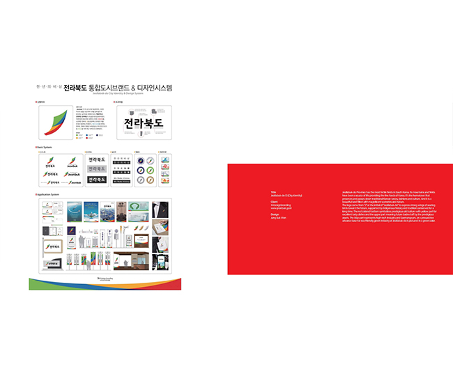
 Title
TitleJeollabuk-do CI (City Identity)
ClientX4designbranding
www.jeonbuk.go.kr
Design Jung Suk Won
Jeollabuk-do Province has the most fertile fields in South Korea. Its mountains and fields
have been a source of life providing the fine foods of Korea. It's the hometown that
preserves and passes down traditional Korean tastes, fashions and culture. And it is a
beautiful land filled with magnificent sceneries and nature.
The logo came from "J" or the initial of "Jeollabuk-do" to express strong wings of soaring
birds toward the future, supported by indigenous history and tradition conserved for a
long time. The red colored bottom symbolizes prestigious old culture with yellow part for
excellent tasty dishes and the upper part meaning future backed off by the prestigious
assets. The blue part represents high-tech industry and Saernangeum, or a prospective
advance base for eco-friendly green industry of Jeollabuk-do is pictured in a green color.